Figures from Lesser Gods
Advance Drafts #7

The manuscript draft of my new book Lesser Gods: Labor in the AI Labyrinth was just sent off to the publisher for the first round of editing. I’ll have more details about the publication schedule in the next few months. It’s a short book, a bit more than 60k words, and also serves as something like a “mini” version of Hellworld, or at least portions of it, offering much more terse overview of themes such as supply chain structure, intra-class conflict, and the degradation of productive subjectivity. The initial article series that served as the seed for the book was published here in draft form, split into three parts: 1, 2, 3.
In addition to the core content covered in those drafts, the book will include a more coherent narrative framework, new sections on physical infrastructures like data centers, and an updated and more cohesive final chapter detailing the rise of “technofascist” Silicon Defense firms like Palantir and SpaceX. The latter includes a brief political-economic analysis of federal military-industrial ventures and extreme inequality in New Mexico, which now serves as the frame for the chapter.
The book also includes a number of figures. Given that they’ll be edited, and I suspect a few will be cut from the final product, I wanted to archive the full range of figures here to give a bit more of a preview of the content. Some are effectively identical to those already included in the advance drafts linked above. But the majority are completely new figures illustrating key points in the argument, including a few larger infographics and a map. I won’t give too much info about each, though I’ll offer a few notes on the context. Also note that this post will have no paywall!
The first figure is from the very beginning of the first chapter, where I explain the technical structure of machine learning models in general, with a particular focus on Large Language Models (LLMs). The purpose is to pry open the “black box” of the model and explain the basic mathematical machinery within, such that the exact role played by human workers in the production of the model will become more clear:
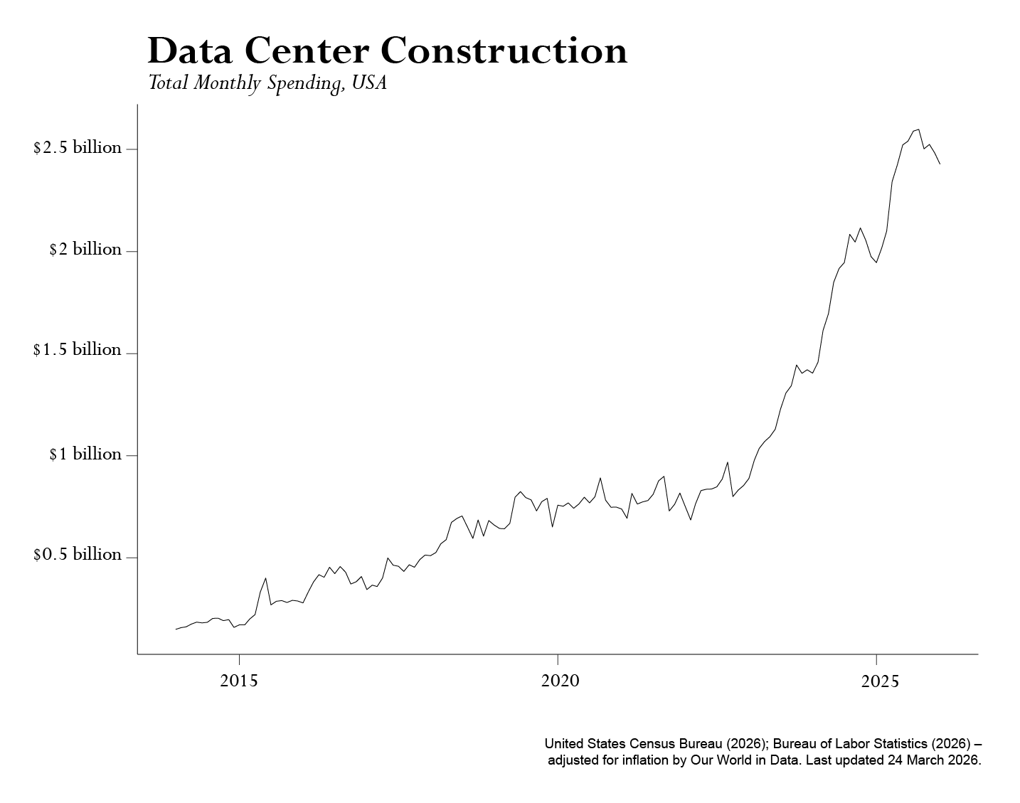
The second is a chart tracking data center construction up through January of 2026 (the latest available data at the time, and still the most recent). This figure helps to illustrate the growth rates of physical infrastructure I’m gesturing to in Chapter 2, which now opens with an extended discussion of data center infrastructure, illustrated via references to the “Organic Machine” of the Columbia Basin.
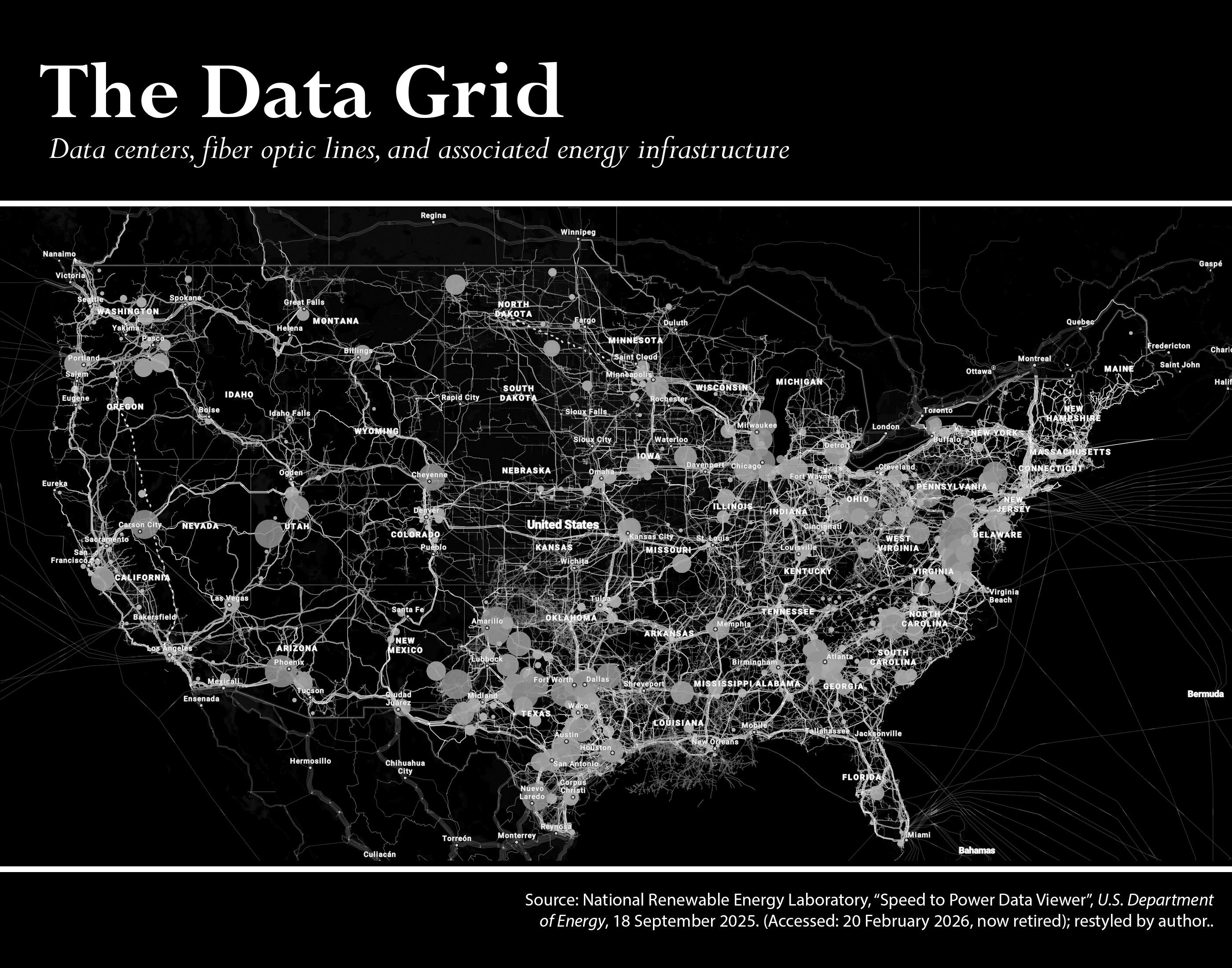
Chapter 2 also includes this map drawn from a now-defunct Dept of Energy National Renewable Energy Lab data service, illustrating data center locations, planned future data centers, fiber optic lines, and associated power grid infrastructure like purpose-build natural gas lines. I simply set the visualizations to show most of the major infrastructure features and data center locations (scaled by power usage) within the public data tool and then printed and stylized the map for B&W. Since this isn’t a proper “built from the ground up” map, I suspect we may have to cut it from the final print, so I wanted to make sure I shared it here:
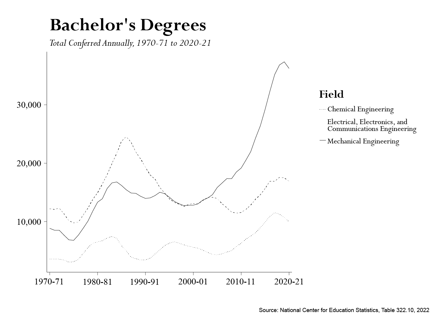
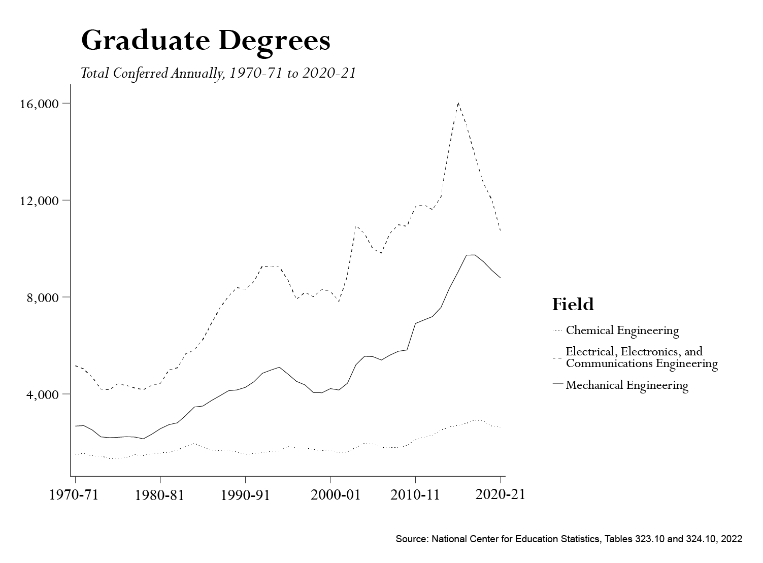
The chapter also includes several of the figures already posted in the drafts on trends in education in STEM fields, with some slight visualization changes:
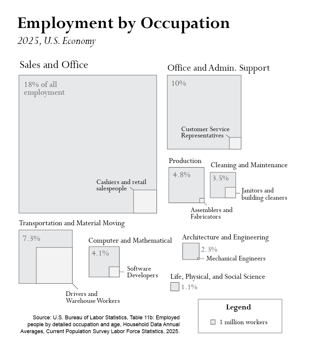
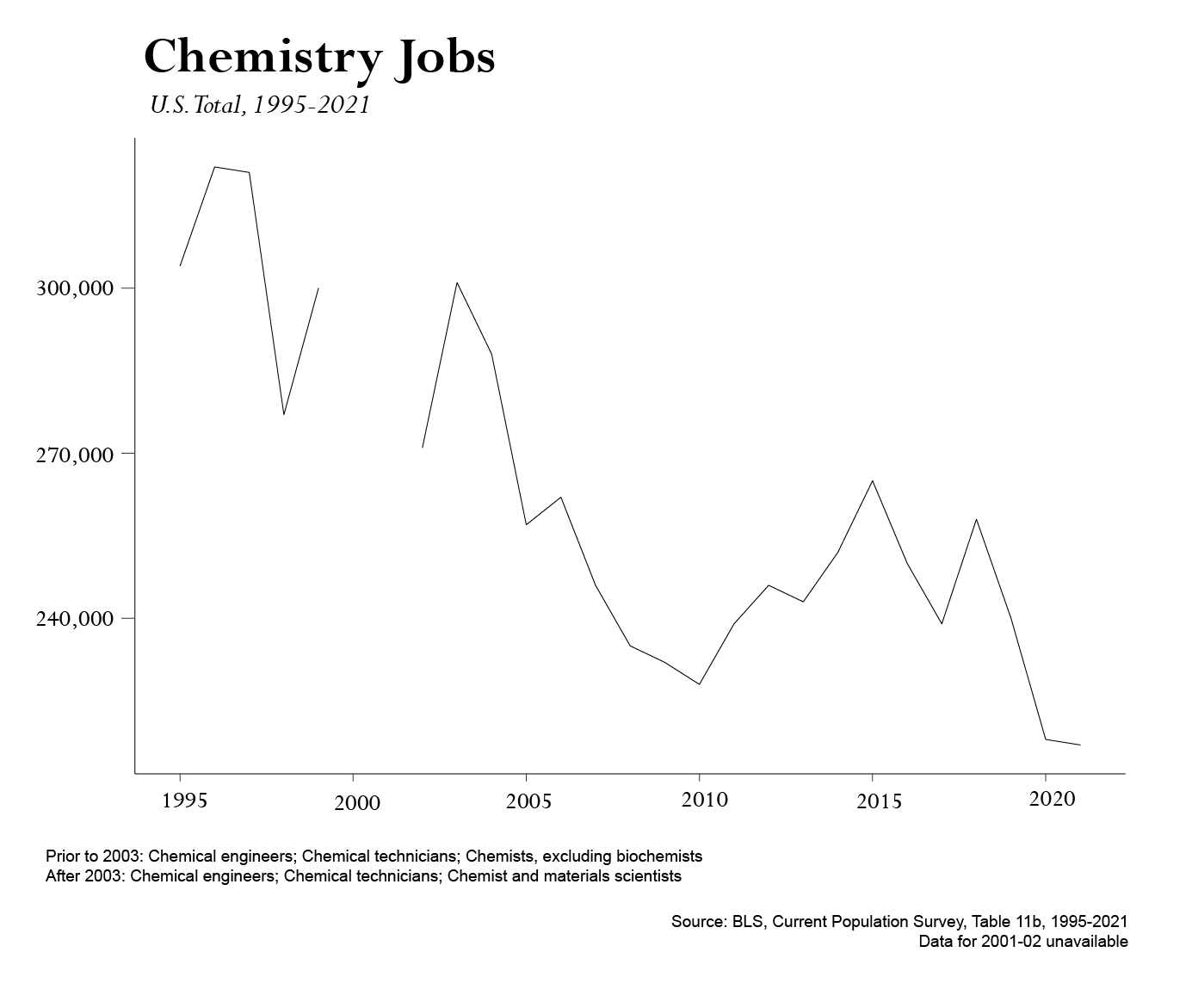
But it also adds a new chart on employment to illustrate the contrasting trends in education and employment:
As well as an infographic that tries to sum up some of the longer paragraphs detailing employment data comparisons: